Mainstay brands, like Farrow & Ball, Benjamin Moore, and Pantone, have looked into their color crystal balls to bring us their predictions for the best in 2022 home decor color trends. Their selections reveal simple, folk-inspired favorites—cleverly combined in modern ways that add a vibrant, vivid, and simple touch to any home or living space.

With the bright yellows of Babouche No. 223 and the uncomplicated, soothing shades of Schoolhouse White and Breakfast Room green, 2022’s trending warm and earthy tones are meant to add a sense of calm, simplicity, and optimism to one’s home in wake of recent times. Use these hues as bold accent walls, on unique home decor accessories, and in your kitchens to make the most of these 2022 color trends.
Keep reading to explore the colors you’ll be finding in homes everywhere in 2022 and learn how to easily incorporate them into your own home or living area.
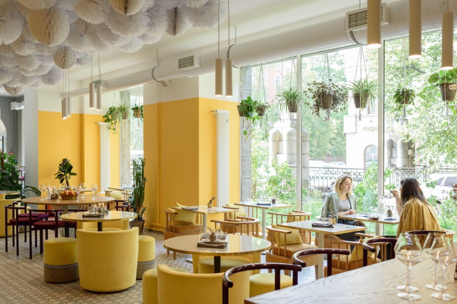
Exploring Babouche No. 223: A Trendy Color for Modern Home Decor
Bright, bold colors like Babouche No. 223’s golden yellow bring back a sense of optimism, normalcy, and positive energy to one’s space. Add a natural bit of earthy sunshine, brightness, and light to your room and pair this vibrant hue with complementing neutrals (Schoolhouse White is great here!) for a kitschy, folk-inspired feel that looks like something you’d find in wonderful world travels.
Consider incorporating this sunny color on doors, curtains and other home decor accessories, or create a vibrant, retro-inspired check flooring pattern to create a striking look for your home.

School House White
With slight red undertones, this nostalgic off-white presents us with the idea of simpler times and promotes a sense of calm in one’s space. It’s muted, timeless, and comfortingly familiar, inspired by the schoolhouses of years past. Add a clean, balanced near-white hue to your room and use this light and airy neutral as a background for big, bold color to prevent it from looking garish or overpowering.
We love this color as an accent note in your decor, although it can also serve as a beautiful blank canvas for making your space your own. Create a bespoke gallery wall or hang an abstract paint by numbers kit upon a School House White wall to create a personalized look and feel to your home.

Breakfast Room Green
This muted green is named after the east-facing rooms that were designed to accommodate quiet mornings eating breakfast in the soft light of dawn. It’s inspired by nature, but also has a softness that will complement bohemian or retro-inspired spaces particularly well. This shade works especially well as a backdrop for your favorite flora and can be combined with other colors, like Stone Blue, for a striking yet familiar touch to your home or space.
Incorporate Breakfast Room Green in designer pillow covers or use it to upcycle outdated furniture that needs a fresh coat of paint.

Stone Blue
The vintage and craft-inspired theme continues with this timeless, muted blue shade. After all, it’s named after the indigo pigment that was imported during the 18th-century to the states! Pair this timeless hue with other warm colors, like Babouche No. 223, to create a sunny, vintage-inspired space. This color also works well with cool tones, too—pair it with whites, grays, and violets for a more modern finish in your home or living area.
We love this muted blue as an accent color on doorways, furniture, and even on personal home decor accessories, like curtains and couches too.

Incarnadine No.248
A clean, rich red, Incarnadine No. 248 is one of the most rustic colors in this year’s trending color palette. This hue combines traditional, bold reds while courting the spirit of opulent 18th century interiors. It makes for a great accent note and creates a sense of luxury, happiness, and pleasure in one’s space or home. It pairs especially well with School House White and foils excellently with Breakfast Room Green, too.
This shade works especially well when paired with brass and gold accents, as well as rustic woodwork and hardwood flooring. Play up the luxurious, opulent feel by opting for heavy velvet textiles and luxurious rugs, or make it more modern by creating a monochrome space.
How to Incorporate 2022 Color Trends into Your Space
This season’s trending colors offer a cleverly combined palette made up of warm, bold colors balanced by a soft and muted off-white. Showcase these vibrant hues, meant to inspire a sense of simplicity, brightness, and optimism, in furniture, home decor accessories, and accent walls in your home or living space. If you’re not ready to commit to painting a wall just yet, start by painting your base cabinets to give your decor a hand-made feel or use it on your ceiling to add a surprising accent that draws the viewer’s eyes upwards.
However you choose to decorate with this year’s trending colors, enjoy this eclectic mix of simple, humble hues that evokes the joys of yesteryear—while still celebrating life’s most special moments as we experience them today.
Related Images:
Latest posts by Modi (see all)
- How To Plan The Most Relaxing Sunday Evening - November 21, 2022
- 10 Key Attributes Of A Brilliant Family Home - November 21, 2022
- How to Decorate an Attic Bedroom - November 17, 2022